
Technical analysis is a highly debated subject because academics say that markets are too efficient to be predicted by simple patterns or indicators on a chart. For some, the whole concept of technical analysis is a fool’s errand.
However, this viewpoint is not completely accurate. The truth is that technical analysis is such a broad and complex area that there are bound to be parts of it that are useful and parts of it that are not.
Moreover, the popularity of technical analysis patterns suggests that many traders do find them useful.
In the rest of this article, I’ll discuss a number of important technical analysis patterns and indicators. Later on, I’ll answer whether or not technical analysis works and show you the results of some historical backtests.
Table of Contents
- Support & Resistance
- Moving Averages
- Fibonacci Levels
- Wedge Pattern
- Head And Shoulders Pattern
- Bull Flag Pattern
- Triangle Patterns
- Pivot Points
- MACD Indicator
- Bollinger Bands
- Average True Range
- RSI Indicator
- Commodity Channel Index
- Parabolic SAR
- Detrended Price Oscillator
- On Balance Volume
- Volume By Price
- Does Technical Analysis Work?
- Backtest Results
- Conclusion
Support & Resistance Lines
Support and resistance lines represent the most basic technical tool. Many of the indicators covered later on are more or less just tools to identify support and resistance levels.
The basic idea behind this concept is that there are price levels that tend to act as barriers or even magnets on a chart. Therefore, traders work to find out where these levels are located.
Support and resistance levels can then be marked as important trading levels where price movements may pause, stop, or reverse.
Support, is seen as a “floor” that can block the price from travelling further South. Therefore support lines help buyers to identify price levels where orders group together. Enough of these orders in one area can help push a stock higher when the support area is encountered.
Resistance, on the other hand, is the opposite of support. It’s located above support and attempts to prevent buyers from pushing the price action above a certain level. If the support line is a “floor”, the resistance is a “ceiling”.
Traders draw lines on a chart to represent areas of potential support and resistance. Often they will trace back to a prior high, low or area of interest.
Logically, the idea of support and resistance makes sense which is why it is a common practice among traders. If a stock continually rejects a certain level, or continues to bounce off an area, it indicates that there is a lot of interest there and potentially a lot of buy/sell orders.
At the end of the day, everyone is looking at the same chart so it follows that investors might put their orders in similar places, such as near a recent high, low, or a round number.
For example, an institution that has an order to execute at a round number (like $100 per share) is bound to create some support in the market just by having so many orders there. This can also create a feedback loop when the order begins to get filled and it’s the job of a trader to try and spot these moments.
As well as horizontal lines, traders can also use trend lines and different technical indicators to find support and resistance. Some of the most popular tools used in this context are moving averages, pivot points, and Fibonacci levels.
Tip: Always think in areas rather than lines. Don’t assume that the more times a support or resistance area is touched the stronger it is. Often, the more times an area is touched, the weaker it becomes.
Moving Averages
Due to their simplicity, moving averages (MA’s) are one of the most popular technical indicators for identifying support and resistance levels on a chart. The MA represents the average price of a financial instrument over a set period.
For instance, applying the 100 daily moving average (DMA) on a chart will show you what the average price in a given asset has been in the last 100 days. The indicator uses daily closing prices from the last 100 days to come up with the number but can also be adjusted to use different price points.
100, 50, and 200 day moving averages are popular periods for higher time frames. On the other hand, scalpers and day traders tend to work with the lower MAs e.g. 5, 7, 10, 20, 21 etc.
As you can see from looking at any price chart, moving averages follow price movements giving a good impression of the overall trend.
When the MA moves higher, it supports the current uptrend. That means its role as a support line ends with a break below the MA. In this case, the MA will automatically transform into a resistance line.
As mentioned, longer moving averages on higher time frames tend to act as long-term support and resistance and the 200-day moving average is widely used for this reason.
Another common way to use moving averages is to implement a crossover strategy. When the fast moving average crosses over a slower moving average it indicates an uptrend. And when the fast MA crosses under the slow MA it indicates a downtrend.
Because of this, getting the right style and length of moving average is crucial. Too fast and you will experience many whipsaws while too slow and you will miss the start of new trends.
Analysis: Below shows net profit for various combinations of moving average crossover applied to S&P 100 stocks between 1/2000 – 1/2020. High net profit values are shown in orange/red while lower values appear in blue/green.
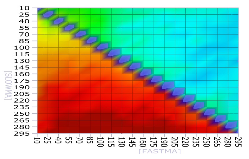
The table shows that there is a sweet spot that runs from 40 days to 190 days for the fast MA and 250 to 295 days for the slow MA.
This implies that the classic 50/200 day crossover is not optimal and a better setup would be 70/280, for example – somewhere in that dark red zone.
Fibonacci Levels
Unlike the moving average, Fibonacci numbers are considered a more advanced technical indicator. Based on the Fibonacci sequence – each number is the sum of the two preceding ones – this technical indicator is used to identify support and resistance levels on a chart.
Traders mostly use the Fibonacci retracement and extension lines for this purpose. The most important Fibonacci retracement lines are: 23.6%, 38.2%, 50%, 61.8%, and 78.6%. The three central figures are considered the most powerful Fibonacci retracement levels. As far as the extensions are concerned, the three most popular extensions are 127.2%, 161.8%, and 261.8%.

A Fibonacci tool is used by connecting a swing high (100%) to a low (0%) and vice versa. This way, retracement and extension levels are generated at the key levels.
Retracement levels are used to see to which degree the price action may pull back to while in the correction mode.
Conversely, extensions identify support and resistance levels behind the endpoint (100%). This way, traders find price levels that may come into play if the price breaks above the identified support or resistance level.
Wedge Pattern
The wedge pattern consists of two trend lines that are drawn to connect important data points (highs and lows) on a chart. These two trend lines converge to create a structure that resembles a wedge.
Converging trend lines act as support and resistance lines. The narrower the space between these two, the higher the likelihood of a breakout. In general, breakouts are usually accompanied by surging volume.

A clear break of the wedge activates the chart pattern and signals a continuation in the direction of the break. Until the break takes place, the wedge is still in draft mode and there should be a distinction between rising and falling wedges.
A rising or ascending wedge takes place during an uptrend. The lower trend line connects the sequence of higher lows, while the upper trend line connects higher highs. A rising wedge is characterized by a consistent ascendance of higher lows, which are quickly catching up with the upper trend line. Before they converge, a breakout takes place to the downside.
Although the ascending wedge occurs in an uptrend, the move higher is usually a part of a bigger downward price movement. Hence, a rising wedge actually helps the sellers to extend the downtrend further lower.
Conversely, the falling or descending wedge takes place in a temporary downtrend. Two trend lines are connecting the lower highs and lower lows. A break takes place when the buyers force the price action to trade above the upper trend line, therefore continuing the overall uptrend.
Price action patterns like this allow traders to trade with the longer trend while placing stops below or above the prior swing high/low. However, such patterns are hard to verify empirically since pattern formations require a hefty dose of subjectivity.
Head & Shoulders Pattern
Head and shoulders is another well known technical analysis pattern. It’s a reversal formation with some similarities to a double top or triple top.
The head and shoulders pattern consists of one main peak (the head) accompanied by two lower peaks on either side (the shoulders). The idea is that when a head and shoulders pattern occurs, it signals that a longer term upward price structure is declining in momentum. This sets the stage for the next longer term down move.
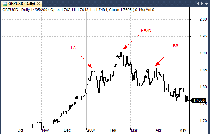
One of the problems, in my eyes, is that the head and shoulders only comes in to play once we get a break of the neckline (which is the lower of the two troughs either side of the head.
The issue is that the market has already lost some value before the break of the neckline so this isn’t going to work well in a market with an upside bias (like equities) but it could be a better pattern in forex.
That’s why in some ways I think that the inverse head and shoulders (simply the same pattern but in reverse signalling a bullish reversal) would be a better suited pattern for equity markets.
However, the other issue is that it is empirically very difficult to code and test, since the pattern can only be found when it is complete, meaning there are many head and shoulders patterns that are subsequently missed by later analysis.
Tip: My analysis of double tops showed very limited profit potential and I would expect a similar finding for the head and shoulders pattern. Nevertheless, a number of price action traders still trade and stick by this pattern.
Bull Flag Pattern
The bull flag is a continuation chart pattern that ultimately helps the uptrend to continue. The formation consists of two key phases: An aggressive uptrend that resembles a flag pole and a consolidation or correction lower that takes place within two parallel trend lines.
Therefore, a bull flag is a relatively rare bullish chart pattern. Following a brief period of consolidation after a strong uptrend, buyers are able to force a breakout to activate the bull flag pattern. Ultimately, a bull flag resembles the letter “F” which is another way to help identify it.

It’s equally important that the consolidation takes place in the form of a descending parallel channel. If the two trend lines converge, then this formation is more classified as a bullish pennant.
The bull flag is the opposite of the bear flag. It takes place in a downtrend with a downward facing pole with sellers in control. The correction period takes place before the sellers resume control and break the flag.
As with wedges, flags are only activated once the break takes place. The breakout provides the clearly-defined levels which can then be used for stop placement. They are often used to get on board trends that a trader may have initially missed.
Analysis: Because of their subjectivity, bull flags are difficult to code and test. I have not yet seen any reliable evidence of their effectiveness.
Triangle Patterns
Ascending triangle
The ascending triangle is a technical analysis pattern that occurs in bull markets. As a security moves higher it forms an uptrend with higher lows. (At this point the security is still far away from it’s recent high and is likely also showing a multiple top). An upward trend line forms connecting the higher lows and this converges on a horizontal upper resistance, forming a triangle pattern.
The key point about all triangle patterns is that as they converge on the price, they form an apex and the price has nowhere to go. It can either break out to the upside and likely enter a strong upward trend. Or, it can break down through the upward trend line in a strong bearish move.
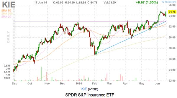
The ascending triangle pattern can be seen clearly in the chart for $KIE. As the triangle pattern converges, the price finally breaks out to the upside and enters a strong up trend.
Descending triangle
Unsurprisingly, descending triangles are the opposite to ascending triangles.
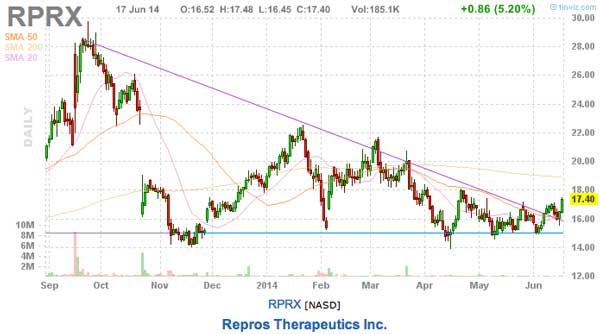
In RPRX, the descending triangle pattern converges on the support line that has formed as a result of a number of multiple bottoms. As the price nears the apex, it moves higher than the descending down trend line and breaks out to the upside. This pattern is usually a good indication that a security is bottoming.
Wedge up
The wedge up is similar to the ascending triangle but instead of a having a horizontal resistance line, the resistance line moves up with the trend. The wedge up therefore always occurs in an up trend and can be used in two ways.
Firstly the wedge up is used as a channel. When the price move to the bottom of the channel it’s a good time to buy and when it moves to the top it’s time to sell. Secondly, when the price breaks out of a channel it’s a sign that the pattern has changed and time to trade in the new direction.
Wedge down
The wedge down works exactly like the wedge up but in reverse. When the price moves to the top of the channel it’s a time to sell and when it moves to the bottom it’s time to buy. Additionally, if you’re holding a short in the down trend, a break out past the upward trend line signals time to close out the short.
Pivot Points
Pivot points are used by intraday traders as a way to visualise possible areas of support and resistance for the upcoming trading day. This gives an intraday trader a guide as to the kind of price range and volatility to expect.
Because it’s based on the previous day’s price action it provides a good guide to the upcoming day. It’s highly likely that price action will trade around the pivot at some point.
- Pivot (P) = (High + Low + Close) / 3
- R1 = P + (P − Low)
- S1 = P − (High − P)
- R2 = P + (High − Low)
- S2 = P − (High − Low)
- R3 = High + 2 × (P − Low)
- S3 = Low − 2 × (High − P)
In terms of execution, a trader will often look for areas of confluence between pivot levels and other previous levels of support and resistance.
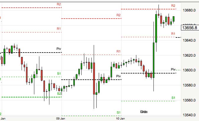
There are no hard or fast rules as to buying support or resistance. It all depends on the flow of the market and what’s going on. However, the levels can give traders a structure to support a trading plan and can provide good profit targets once a trade is in place.
Analysis: The S&P 500 has traded through the pivot point on approximately 70% of all trading days since 1962. It has also traded through first resistance on roughly 48% of days and through first support on only 17% of days.
MACD Indicator
The Moving Average Convergence/Divergence (MACD) is a technical analysis pattern that belongs to the family of oscillators. It’s designed to calculate the relationship between two exponential moving averages (EMA) – usually the 26 EMA and 12 EMA (standard setting).
The EMA is a more advanced moving average as it places additional weight and importance to the most recent data, unlike the standard MA that uses all prior data points equally. As a result, an EMA reacts to price changes more quickly but can also lead to increased fake signals.
The two above-mentioned exponential moving averages (26 and 12) create the MACD line. In addition, a 9-period EMA is classified as a signal line. The interlinking between these two trend lines generates different signals.
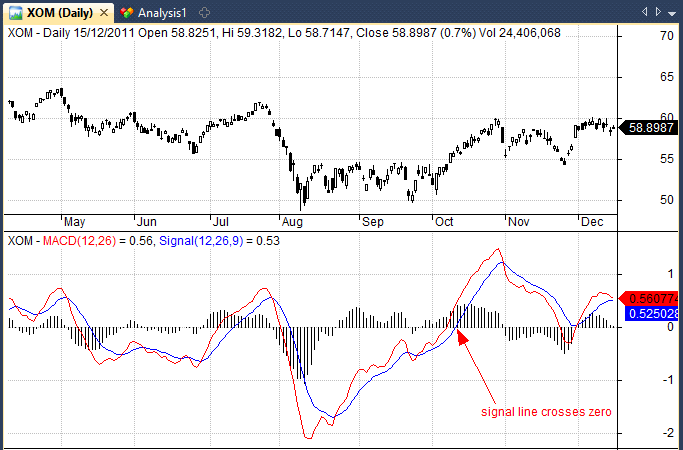
Traders’ interest is focused on three potential developments: A crossover, histogram, and divergence. A bullish crossover happens when the signal line drops below the MACD line, and vice versa for the bearish crossover.
Histogram (green and red values) calculates the distance between the MACD and its signal line. As such, it also generates bullish and bearish signals and traders have different ways of interpreting the results.
Divergence is also a commonly used MACD signal. A bullish divergence takes place when the MACD indicator is moving higher and the histogram is green, however, this trend is not reflected in actual price movements which may be moving lower.
In this situation, the MACD indicates that the price is likely to start catching up with the indicator soon and so a bullish signal is generated. The bearish divergence works in the same fashion, but with the opposite effect.
Analysis: Using historical data from Norgate I backtested the classic MACD(12,26) crossover signal and recorded an average profit per trade of 0.26% over 10-days.
This is for S&P 500 stocks with a 10-day holding period and was lower than the average 10-day return for all stocks in the sample.
In other words, the MACD did no better than a random entry. You can find more details of this study further down the page.
Bollinger Bands
Developed by John Bollinger, Bollinger Bands act as support and resistance areas based on standard deviations away from the current price level.
The typical setting for a Bollinger Band is a 20-day moving average with an upper band placed two standard deviations above the MA and a lower band placed two standard deviations below the MA. The lower bands act as support while the upper band acts as resistance but of course, traders will often alter the parameters to their taste.
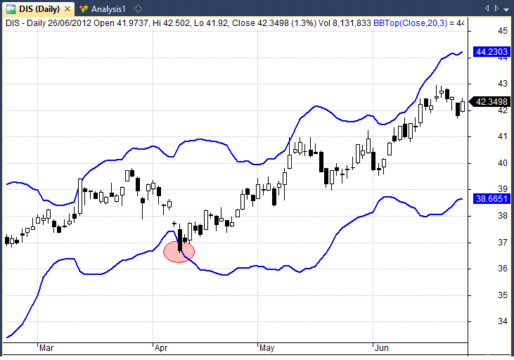
Important points to remember about Bollinger Bands are that:
- Tags of the bands are just that, tags not signals. A tag of the upper Bollinger Band technical analysis pattern is NOT in-and-of-itself a sell signal. A tag of the lower Bollinger Band is NOT in-and-of-itself a buy signal.
- In trending markets price can, and does, walk up the upper Bollinger Band and down the lower Bollinger Band.
- Closes outside the Bollinger Bands are initially continuation signals, not reversal signals.
- Make no statistical assumptions based on the use of the standard deviation calculation in the construction of the bands. The distribution of security prices is non-normal and the typical sample size in most deployments of Bollinger Bands is too small for statistical significance. (In practice we typically find 90%, not 95%, of the data inside Bollinger Bands with the default parameters)
Bollinger Bands tend to be one of the most popular technical analysis indicators because they are highly logical and simple to use.
Analysis: Bollinger Bands have historically been used in both mean reversion systems and momentum systems.
Backtesting a close under the bottom Bollinger Band with (20,3) setting on US S&P 500 stocks produced an average profit per trade of 0.10% over a 10-day holding period.
Average True Range Indicator
The Average True Range (ATR) is a popular technical analysis pattern used to measure volatility. This was developed by J. Welles Wilder, a technical analyst who is also credited for the development of the popular Relative Strength Index (RSI) indicator.
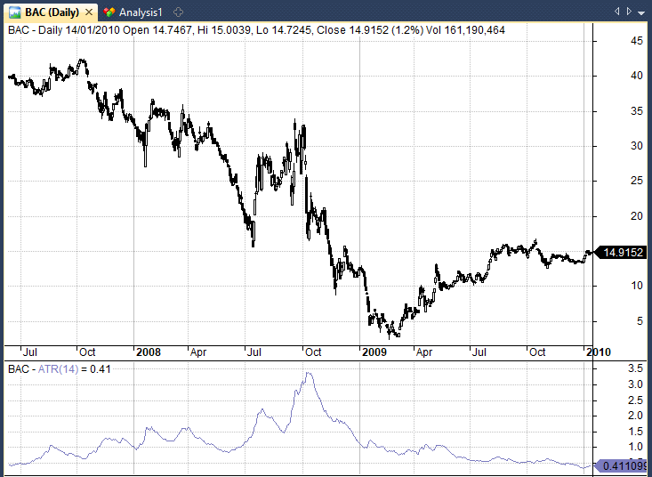
ATR generates signals whenever the price action exceeds or drops below an average ATR value for that day. This way, ATR readings are increasing and decreasing.
Besides signals, the ATR is also used to find trading ranges and identify the limit of moves higher and lower. Moreover, the ATR is used to calculate where to exit a trade or to decide on the size of the trade.
You may frequently hear traders say “2 ATR stop” or “3 ATR stop”. This means that they set a stop-loss at a distance two or three times the size of the ATR at entry.
For example, if ATR(14) is $5 at entry, a 3 x ATR stop will be placed $15 below the entry price.
Tip: When comparing ATR across securities it is useful to normalize the indicator to account for different share prices. For example, a $1000 stock is likely to have a bigger ATR than a $5 stock even if the $5 stock is more volatile.
RSI Indicator
Devised by the same author as the ATR, the RSI indicator is one of the most popular technical analysis patterns and I have covered it many times already on this blog.
RSI is an oversold/overbought momentum oscillator that can give both momentum signals and mean reversion signals. Momentum investors will often use a longer RSI such as RSI(14) and look for a cross of zero or 70 as a signal to go long.
Meanwhile, it is common for mean reversion traders to use a shorter period such as RSI(2) or RSI(3) and go long when the indicator is significantly oversold such as under 5.
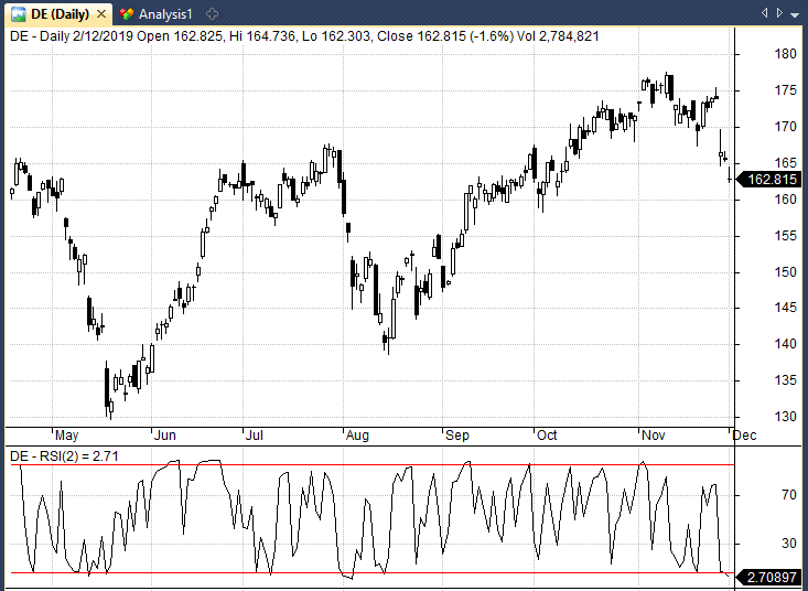
Analysis: Across a sample of 64,620 trades, I found the RSI(2) < 5 signal produced an average profit of 0.52% with a 10-day holding period. More details below.
CCI indicator
The Commodity Channel Index (CCI) is a technical indicator used to identify long-term trend changes. Its developer, a technical analyst Donald Lambert, was analyzing markets with an aim of identifying cyclical trends in historical price movements.
As the name suggests, the CCI indicator was originally created for the analysis of the commodity market. However, its popularity means that it is used by traders of all financial instruments.
In essence, the CCI is classified as a momentum-based oscillator. It works in a way that compares the current price to an average price over a set period of time. The default setting is 14, which means it makes a calculation based on data from the last 14 periods.
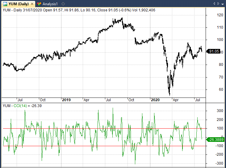
Traders can increase or decrease this number, bearing in mind that the lower the setting is, the higher the sensitivity. As an oscillator, the CC moves between -200 and +200 readings.
This way, it works to generate signals about the current state of the market, with the focus on the “overbought” and “oversold” conditions. Given that markets spend a vast majority of time in a ranging mode, the CCI usually moves between +100 or -100.
A move below -100 or above +100 signals weakness or strength in the market. Thus traders use these moments as opportunities to go short or long.
Parabolic SAR Indicator
The Parabolic SAR is a technical indicator that serves to identify the price direction of a financial asset and signalize a potential price reversal.
The indicator was also designed by J. Welles Wilder, the creator of RSI and ATR technical indicators. Parabolic SAR is also known as the “stop and reversal system”. This is how you calculate the Parabolic SAR indicator:
RPSAR = Prior PSAR +[Prior AF(Prior EP-Prior PSAR)]
FPSAR = Prior PSAR −[Prior AF(Prior PSAR-Prior EP)]
Where:
- RPSAR = Rising PSAR
- FPSAR = Falling PSAR
- AF = Acceleration Factor, it starts at 0.02 and
- increases by 0.02, up to a maximum of 0.2, each
- time the extreme point makes a new low (falling
- SAR) or high (rising SAR)
- EP = Extreme Point, the lowest low in the current downtrend (falling SAR) or the highest high in the current uptrend (rising SAR)
When plotted on a chart, Parabolic SAR appears as a set of dots above or below the price bars. If the dots are showing below the price, that’s considered a bullish signal.
To the contrary, if the dots are above the price bar, that means that bears control the market and the price will likely keep its downward momentum.
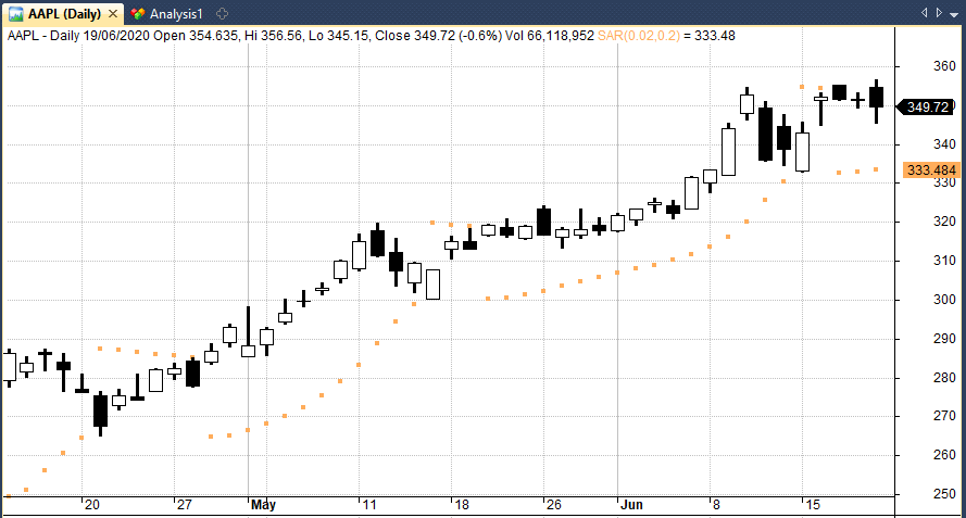
If the dots flip, a potential price reversal could be expected. For instance if the dots are placed above the price at first and then flip below it, a new price rally is possibly underway.
The series of dots rise with respect to the price increase, first at a slow pace and then speed up together with the trend. The indicator picks up speed as the trend rises and the dots match the price rise.
Keep in mind that while Parabolic SAR provides reliable results in a trending environment, it can also send fake signals. As always, it is crucial to use settings that give the right balance between responding to new trends and preventing fake signals.
Tip: Parabolic SAR can be used as a stop loss and works well when applied to fast moving and exponentially trending stocks.
Detrended Price Oscillator
The Detrended Price Oscillator (DPO) is a technical indicator used to mitigate the impact of short-term price movements in estimating the trend. In other words, the oscillator flattens the price movements to display wider price trends. Therefore, DPO is quite different from other momentum indicators.
The Detrended Price Oscillator’s standard setting is 20 periods. This setting is typical not only for DPO but for many other indicators. This is because the daily chart is the most popular charting time frame and there are roughly 20 trading days per month. Accordingly, it takes around one month of data to calculate the DPO.
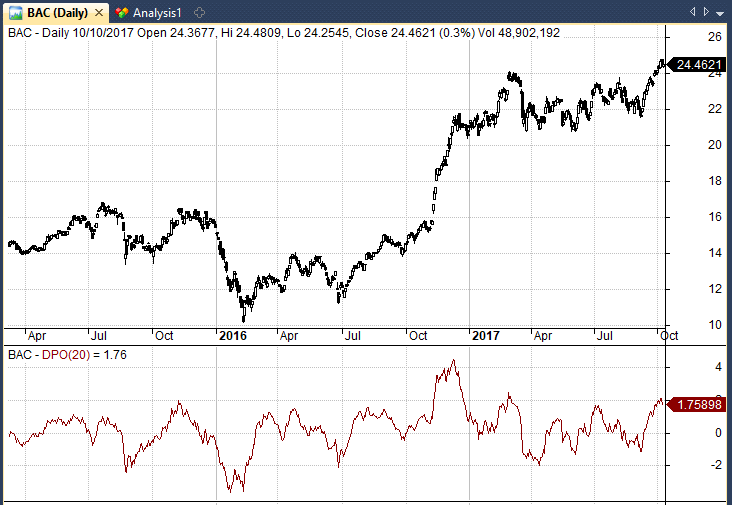
Using the 20-period default setting, the formula for calculating the oscillator would be:
The price (20/2 + 1 = 11) periods ago – 20-period SMA.
The DPO indicator is popular among mean reversion traders who look for large deviations away from zero before betting that the stock will reverse back. Meanwhile trend trades usually use a cross of zero as their signal to go long or short.
Clearly, the period can change according to the trader’s personal choice. For trend traders, a setting of 21 is often used while mean reversion traders will often look at a lower setting.
Tip: An interesting strategy using DPO and Point-in-Range is shown in the book Mean Reversion Trading Systems By Howard Bandy.
On-Balance Volume Indicator
The On-Balance Volume Indicator (OBV) is commonly used to anticipate price movements based on an asset’s volume levels. The indicator was first mentioned in 1963 by Joe Granville, in his book called “Granville’s New Key to Stock Market Profits”.
The main concept revolves around the idea that volume plays a major part in price movements and it can therefore help predict price changes.
In theory, if the volume of a security or an asset drops without a concurrent drop in price, a price decline can be expected. Conversely, if the volume surges without a concurrent surge in price, a price increase is expected.
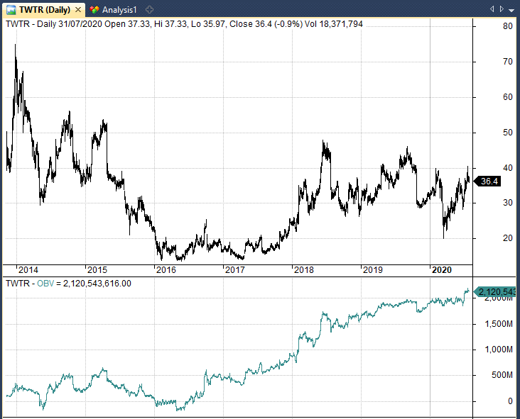
OBV is a cumulative indicator. This means that when the price of an asset rises, the indicator adds volume and when the price drops it deducts volume. This is the formula for calculating the On-Balance Volume Indicator:
If today’s price is higher compared to yesterday’s price:
- OBV = OBV (yesterday) + Volume today
If today’s and yesterday’s closing price are equal:
- OBV = OBV (yesterday)
If today’s price is lower than yesterday’s price:
- OBV = OBV (yesterday) – Volume today
When the latest closing price is higher compared to the previous closing price, the day’s volume is called up-volume. On the other hand, if the last closing price is lower than the previous one, traders call it down-volume.
Volume By Price Indicator
Volume-by-Price refers to a chart indicator that displays the amount of volume for a specific price range, predicated on closing prices. The bars of the indicator are horizontal and plotted on the left side of the chart, associated with the price ranges.
On the chart, these bars appear in a single or in two colors to make the distinction between up volume and down volume. By joining volume and closing prices, Volume by Price can be utilized to determine high-volume price ranges and identify support and resistance areas.
Logically, a price area with a lot of volume shows a heightened degree of interest around that zone while low volume areas indicate lack of interest and orders. This is important, since when a high volume area is broken out of, price often moves swiftly through the low volume ranges.
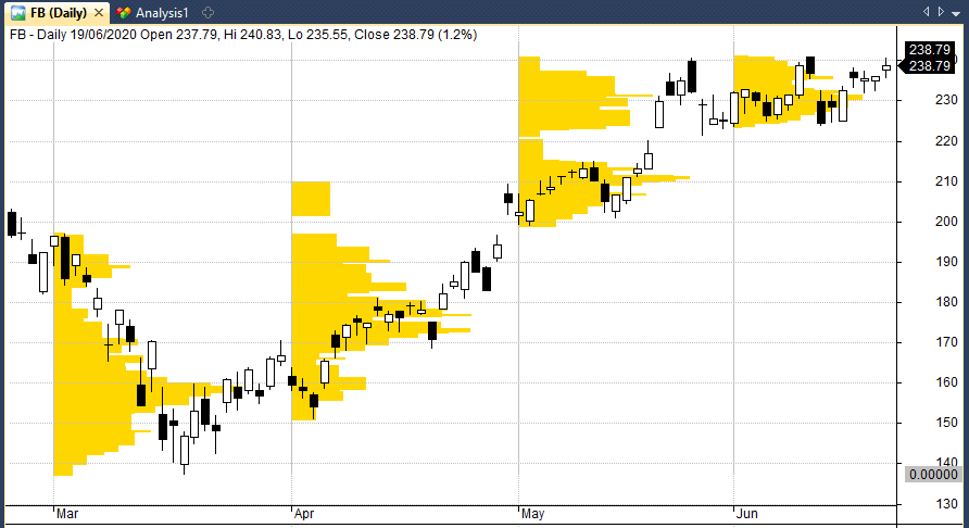
As you will note from volume by price charts, the holy grail is to get your orders in at levels with the lowest volume. It is these levels that price rarely sticks around and often rebounds.
Some VBP indicators also outline the difference between buying and selling volume by tinting the sections with green or red. This can be particularly useful to distinguish heavy resistance and support zones instead of characterizing generic levels only.
Keep in mind that price by volume charts display the total volume at specific price levels over a specific period of time. Therefore, support and resistance areas might run out of significance on a long enough time scale.
This is particularly true, if an earnings report or market event has changed the dynamics of the stock.
Does Technical Analysis Work?
So far in this article we have looked at various types of technical analysis patterns and we have provided some insight into how traders typically use these indicators.
However, the difficulty with any evaluation of technical analysis is that patterns and indicators are always interpreted by traders in different ways. This is particularly true with respect to price action patterns that rely on a large dose of personal opinion.
Getting patterns like wedges, trend lines, bull flags and head and shoulders written down in code is notoriously difficult and therefore makes empirical backtesting almost impossible.
Aside from technical indicators, position sizing, risk and portfolio management are all crucial factors that can dictate whether a technical analysis strategy lives or dies.
This will always be the case when it comes to technical analysis which makes it hard to say with any authority if technical analysis is effective or ineffective. However, there are some patterns and indicators that we can backtest.
Technical Analysis Backtest Results
While some technical patterns are notoriously difficult to code, we can still test a number of different technical indicators and breakouts.
The table shown below reveals average returns from popular trading setups for 10 and 50 days after the signal takes place. In other words, we buy a stock after the trading signal then measure the return after 10 or 50 days. We also compare these results to a benchmark ‘all trades’ result which is the average return for every stock with no trading signal.
These results come from testing 1800 S&P 500 stocks between 1/2000 – 1/2020. Data includes delisted stocks and historical constituents to minimize survivorship-bias but does not include transaction costs:
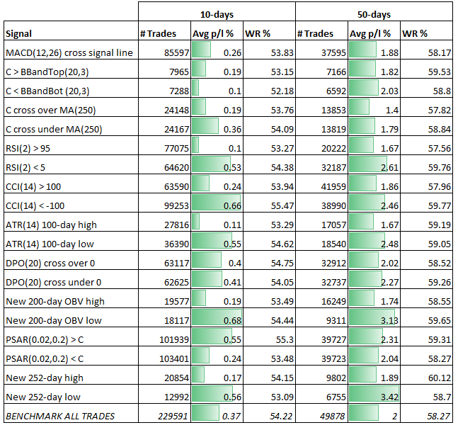
As you can see from the table above, we have recorded some interesting but mixed results across a selection of different technical analysis patterns and indicators.
Over 50 days, the best indicator we tested was actually a new 252-day low. This produced an average profit per trade of 3.42% compared to the all trades benchmark result of 2%.
(The all trades benchmark represents the average return for all the stocks in our sample without any trading rule).
The next table shows a more detailed summary of our analysis:
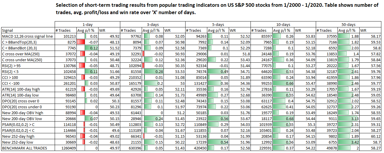
Observations
The tables above show mixed results for a number of different technical indicators. Many technical indicators did not do any better than the average result from all trades in the sample (the last row in the table).
The MACD (12,26) signal, for example, performed worse than the benchmark over 5, 10 and 50 days. Likewise, many of the indicators did not show enough edge to suggest they were any better than random.
If there is something to be gleaned from this analysis it is that the mean reversion trades clearly produced better results than the momentum trades.
RSI(2) under 5, new 200-day low in On Balance Volume and new 252-day price low all performed strongly. These setups produced average profits per trade of 2.61%, 3.13% and 3.42% respectively over 50 days.
This is interesting because in a previous study , (albeit with much longer holding periods) I found that new highs were better than new lows.
Needless to say, these are all raw backtest results and no trader is likely to trade off these signals on their own.
But perhaps combining an RSI(2) reversal with On Balance Volume and some fundamentals could result in a profitable swing trade?
Another Approach
While we can do some analysis on indicators, an alternative approach would be to follow a group of investors (those who use technical analysis and those who do not) and see how each group performs over a large sample of trades.
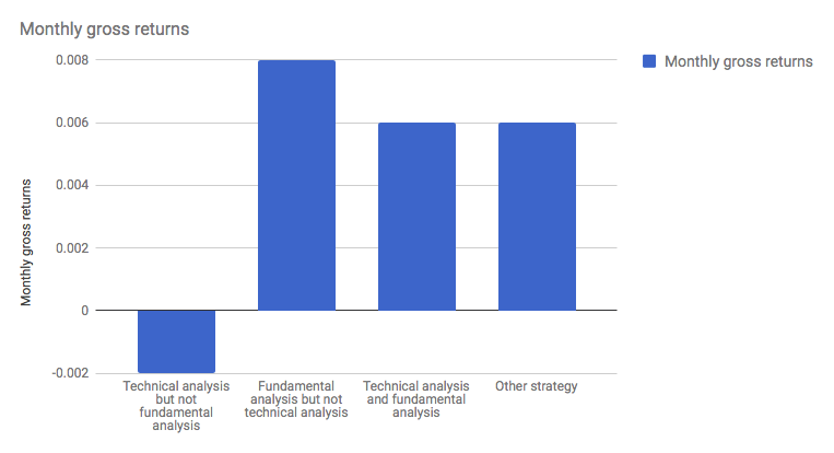
I have seen such analysis before and wrote about it in a previous article. The findings were that technical analysis was inferior to fundamental analysis during normal times but technical analysis proved more valuable during volatile periods.
Meanwhile, another study found that investors who used fundamental analysis outperformed those who only used technical analysis.
All that said, I feel that more research needs to be done into this area and we need to see more evidence before making any concrete judgement.
Conclusions
In this article we have looked at a number of technical anlaysis patterns that traders use and we have only scratched the surface.
The truth is that technical analysis is such a broad and complex area, saying it doesn’t work is like saying psychology or economics doesn’t work. Clearly, there are areas of technical analysis that are effective and areas that aren’t.
You could say that the fact it’s still being used today means that investors must find some use and value in it.
In my eyes, technical analysis is most effective when distilled into code and used to create a quantitative approach to trading. Or when it is combined with both experience and fundamentals.
Technical analysis is such a broad area that it is worth exploring and learning about in some depth. In future articles I intend to take a look at other types of technical indicators like market breadth.
Thanks. Good job.
I suspect if the Fibonacci retacement really works.
Cheers Chris.
Very enlightening! I’d like to see an analysis of price reversion to a long-term linear regression.
Ok.
That’s very useful! Thanks!
Question: your bottom line would depend on the avg trade profit TIMES the win rate I presume?
Another question: Let’s say the 1 day return is negative, but the 3 day return is good, would you conclude that entering on day 2 would be better still?
All the best,
Ola
I like your idea but I wouldn’t conclude that necessarily without more testing. These are very rudimentary results that can offer clues as to what direction to go in but they do not offer concrete answers for trading. For example, the analysis doesn’t show a timeline of trades. If all the winning trades took place at the same time then the real profitability could be inflated and vice versa. Showing the average p/l and win rate on a large sample is a good first step but more testing is needed before trading. Cheers!
Thanks for the reply. Good point. I’m looking forward to more test results! Excellent work!
No problem thanks for the feedback.
hi Joe,
very good and detailed work (as usual)! 🙂
Have you back tested these setup against other time frames or underlyings (FX etc.)?
Would be interesting to see if the outcome is any different.
best regards,
Patrick
No I haven’t yet. It might be worth looking into.
Hi Joe, another great article! I wanted to point your readers towards more material to help them build on the foundations you’ve established: https://www.edocr.com/v/agzezp9y/trustedbrokerscom/Top-5-Technical-Analysis-PDFs
This presentation curates technical analysis PDFs and studies. You’ll find a few big name authors. It helped me get my head round tricky concepts, and hope others will find value in it too.
Thanks for the content,
I love to follow, please keep being updated